The sport of baseball, more than any sport, at any given point in time, has huge amounts of data available to the general public, largely because of resources like Baseball Savant, and fantastic sites like FanGraphs and Pitcher List. Statcast data from Baseball Savant is incredible because it provides a ton of tracking data for every pitch, including pitch speed, release point, and movement, as well as hitting metrics like launch angle, exit velocity, and xwOBA.
This tutorial will walk through one of the best programming languages for quick, concise data analysis - R. It will explore the different ways, using R, to acquire, manipulate, and visualize Statcast data. R is a powerful tool with a relatively small learning curve, and through the efforts of many generous people, there is a massive collection of resources to learn R (for free!).
This tutorial is recommended for those already familiar with R. If you’re a beginner, I highly recommend R4DS. It is a valuable guide to starting out in R, and especially emphasizes use of the tidyverse, which makes the entire data science process and workflow far more intuitive and uniform. Now, on to the tutorial!
Load in Packages
For this analysis, you’re going to need a few packages. The {tidyverse} is essential for every project and includes packages for data manipulation, visualization, and more. Additionally, the {baseballr} package lets us scrape Statcast data directly from the MLB API into our R session and the {mlbplotR} package makes it easy to incorporate MLB logos and headshots into our plots an tables. Lastly, the {gt} packages lets us easily build presentable tables and the {ggtext} package lets us use HTML in our our plot text.
# If you don't have these packages already installed, uncomment# the lines with install.packages() and run them as well# install.packages("tidyverse")# install.packages("baseballr")# install.packages("mlbplotR")# install.packages("gt")# install.packages("ggtext")library(tidyverse)
── Attaching core tidyverse packages ──────────────────────── tidyverse 2.0.0 ──
✔ dplyr 1.1.1 ✔ readr 2.1.4
✔ forcats 1.0.0 ✔ stringr 1.5.0
✔ ggplot2 3.4.2 ✔ tibble 3.2.1
✔ lubridate 1.9.2 ✔ tidyr 1.3.0
✔ purrr 1.0.1
── Conflicts ────────────────────────────────────────── tidyverse_conflicts() ──
✖ dplyr::filter() masks stats::filter()
✖ dplyr::lag() masks stats::lag()
ℹ Use the conflicted package (<http://conflicted.r-lib.org/>) to force all conflicts to become errors
# You can also run View(mlb_data) to open up the data in a tab if you are# using the RStudio IDE
The dim() function tells us that our data frame has 78713 rows of 92 different variables. You can look at the different columns and the type of data they store with the str() function.
Add Columns
We need to create some additional columns that will easily let us summarize our data, and this is pretty simple with the dplyr::mutate() + dplyr::if_else() combo. First, let’s use baseballr::mlb_people() to get the names of the hitters for each pitch. The description column of our data has info on what events happened on each pitch, so let’s create some binary indicators using this column that tell us if different events like a swing, whiff or chase happened, inning_topbot with home_team and away_team let us know who the batting and pitching teams are. I created the swing_events and whiff_events vectors to hold all the different values of description that are swing events, as well as whiff events. Using the %in% operator, we can then check if the event in description is one of the events from each vector. This procedure is how you can determine if a value is included in a group of many possible values.
swing_events<-c("foul_tip", "swinging_strike", "swinging_strike_blocked", "missed_bunt", "foul", "hit_into_play", "foul_bunt", "bunt_foul_tip")whiff_events<-c("swinging_strike", "foul_tip", "foul_bunt", "missed_bunt", "swinging_strike_blocked")hitter_names<-mlb_people(unique(mlb_data$batter))%>%select(batter =id, hitter_name =last_first_name)full_mlb<-mlb_data%>%# drop any missing rowsmutate( is_swing =if_else(description%in%swing_events, 1, 0), # binary indicator for a swing is_whiff =if_else(description%in%whiff_events, 1, 0), # binary indicator for a whiff is_in_zone =if_else(zone%in%1:9, 1, 0), # binary indicator for in-zone is_out_zone =if_else(zone>9, 1, 0), # binary indicator for out-of-zone is_chase =if_else(is_swing==1&is_out_zone==1, 1, 0), #binary indicator for swing is_contact =if_else(description%in%c("hit_into_play", "foul", "foul_pitchout"), 1, 0), # binary indicator for contact hitting_team =if_else(inning_topbot=="Top", away_team, home_team), # column for batting team pitching_team =if_else(inning_topbot=="Top", home_team, away_team), # column for pitching team)%>%left_join(hitter_names, by ="batter")
Now that our data has everything we need, let’s move on to summarizing and exploring it!
Pitch Type
Data can be most efficiently aggregated using dplyr::summarize(), and to aggregate by different groups, you can use dplyr::group_by() function to group the data before passing it to summarize(). It is best practice to ungroup data after the grouping is no longer needed, and this can be done with dplyr::ungroup(). However, the dplyr team recently added the .by argument to summarize(), where one can supply the name of a column or a vector of column names to perform operations by, essentially a grouping. Groups are automatically dropped after operations are performed. This addition is convenient because it eliminates the need to use group_by() and ungroup() in aggregations. For this aggregation, let’s filter out any rows that are missing a pitch type (including rows that have the “FA” pitch type, which is “Other” pitches), then find the Swing%, SwStr%, Whiff%, Zone%, Chase%, and Run Value/100 for each pitch type, and after aggregating let’s drop any pitch type that has been thrown 25 times or less.
Now, let’s compare the results the different pitch types have garnered this year. A gt table with data_color(), fmt_percent() and fmt_number() to make the numbers more presentable provides a quick visual representation along with the underlying numeric figures.
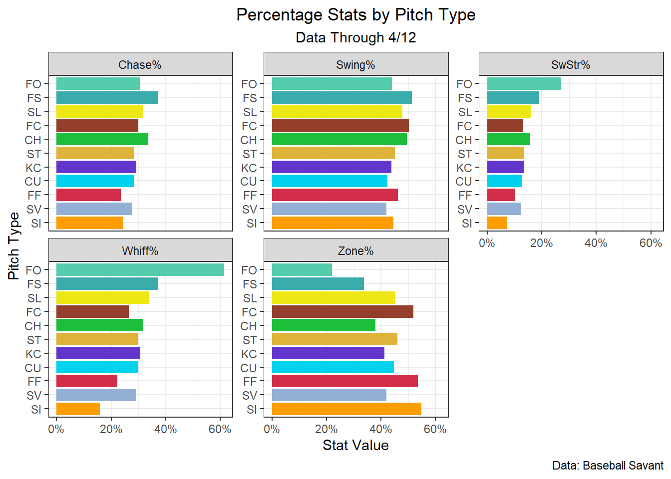
Splitters have induced swings at the highest rate of any pitch, despite only being thrown in the zone 34% of the time. The forkball, thrown by Mets’ rookie Kodai Senga, has had elite results,despite running a Zone% of just 22%. Sinkers, four-seamers, and cutters, unsurprisingly have been placed in the zone the most of any of the pitch types. By run value per 100 pitches, the forkball and slurve have been the best pitch types in 2023, and the knuckle curve and changeup have been the worst.
It’s also possible to compare each statistic visually for all the pitch types by leveragingggplot2::facet_wrap(), which will create a panel for each unique value of the column you supply it with. To get the data in a format that allows this to work, we need to pivot it into a row for every combination of pitch type and statistic. Luckily, this can easily be done using tidyr::pivot_longer(). After the columns containing the different stat values have been pivoted into a single cloumn, we’ll change that column using dplyr::case_match() to have more presentable names for the statistics than the names that were used for them in the data (eg. ‘swstr_perc’ to SwStr%). Using these functions, let’s create a plot to compare different the different stats for different pitch types, specifically the percentage stats.
sc_colors<-c("FF"="#D22D49","SI"="#FE9D00","FC"="#933F2C","SL"="#EEE716","ST"="#DDB33A","SV"="#93AFD4","KC"="#6236CD","CU"="#00D1ED","FS"="#3BACAC","FO"="#55CCAB","CH"="#1DBE3A")# Swing% by pitch typepitch_type_rates%>%select(-run_value_rate)%>%# drop non-percentage statpivot_longer(swing_perc:chase_perc, names_to ="stat_name", # name column that will hold the names of the columns to stat_name values_to ="stat_value"# name column that will hold the values of the stat columns to stat_value)%>%mutate( stat_name =case_match(# make stat names more presentablestat_name,"swing_perc"~"Swing%","swstr_perc"~"SwStr%","whiff_perc"~"Whiff%","zone_perc"~"Zone%","chase_perc"~"Chase%"))%>%ggplot(aes(stat_value, reorder(pitch_type, stat_value)))+geom_col(aes(fill =pitch_type), show.legend =FALSE)+# use statcast colorsscale_fill_manual(values =sc_colors)+# use % on x-axisscale_x_continuous(labels =scales::label_percent(accuracy =1))+facet_wrap(~stat_name, scales ="free_y")+# scales = "free_y" lets the x-axis vary for each facettheme_bw()+theme( plot.title =element_text(hjust =0.5), # center plot title plot.subtitle =element_text(hjust =0.5)# and subtitle)+labs( x ="Stat Value", y ="Pitch Type", title ="Percentage Stats by Pitch Type", subtitle ="Data Through 4/12", caption ="Data: Baseball Savant")
This graph makes it simple to easily compare pitch types with a quick glance.
Over Time
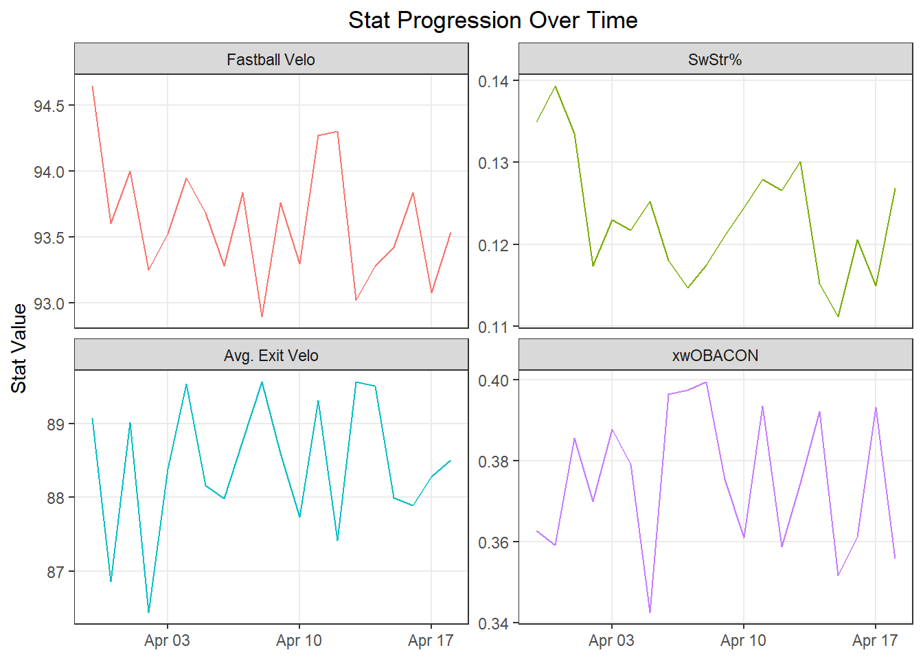
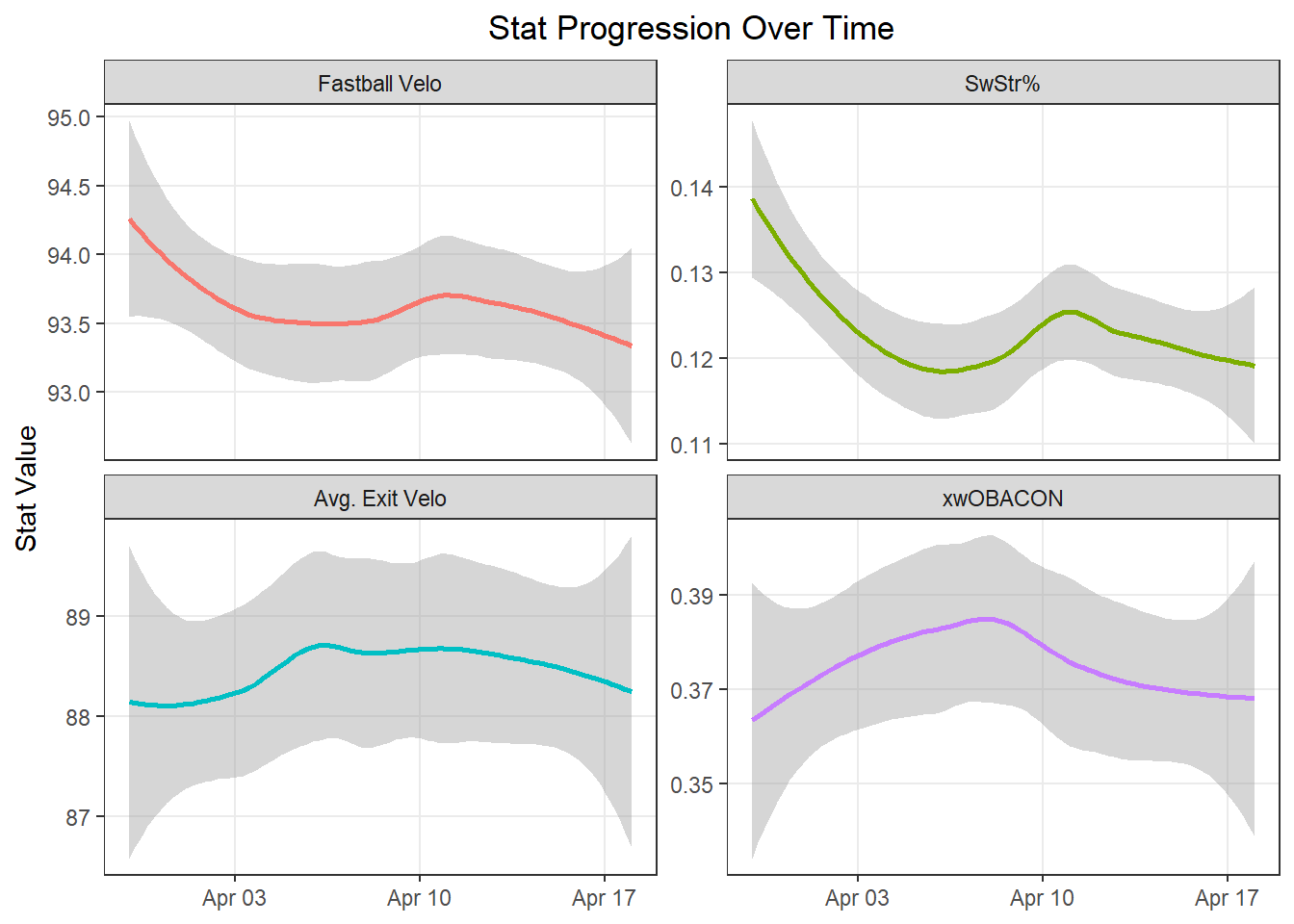
With the same use of pivot_longer(), let’s check out how a few important stats have progressed league wide. To do this, we summarize our stats by day (game_date), and then pivot. Let’s use two different visualization types, geom_line() to see the raw values, and geom_smooth() to see a smoothed trend.
`geom_smooth()` using method = 'loess' and formula = 'y ~ x'
Fastball velocity peaked on opening day and has trended down since, along with SwStr%, while exit velocity and xwOBACON have fluctuated with no clear pattern.
Team Stats
It’s also easy to take a look at both hitting and pitching data for teams. First, let’s write a function, find_team_stats() to summarize data, and apply it to both pitching and hitting data for each team.
# function to summarize datafind_team_stats<-function(.data, team_grouping){.data<-.data%>%mutate(launch_speed_fixed =if_else(type=="X", launch_speed, NA))%>%summarize( swing_perc =mean(is_swing, na.rm =T), chase_perc =sum(is_chase, na.rm =T)/sum(is_out_zone, na.rm =T), contact_perc =sum(is_contact, na.rm =T)/sum(is_swing, na.rm =T), avg_ev =mean(launch_speed_fixed, na.rm =T), xwobacon =mean(estimated_woba_using_speedangle, na.rm =T), woba =mean(woba_value, na.rm =T), run_value_rate =mean(delta_run_exp, na.rm =T)*100, .by ={{team_grouping}})return(.data)}hitting_stats<-full_mlb%>%find_team_stats(hitting_team)%>%rename_with(~paste0("hitting_", .x), # easily designate columns as batting data .cols =swing_perc:run_value_rate)pitching_stats<-full_mlb%>%find_team_stats(pitching_team)%>%rename_with(~paste0("pitching_", .x), # easily designate columns as pitching data .cols =swing_perc:run_value_rate)team_data<-hitting_stats%>%full_join(pitching_stats, by =join_by(hitting_team==pitching_team))%>%rename(team =hitting_team)
Now, let’s take a look at hitting data. We’ll put together a table to find which teams have had the best hitting results this year.
By wOBA, the Rays, Braves, and Orioles have had the best team offenses this year. The Rays and the Orioles have succeeded with more contact-oriented lineups, whereas the Braves have absolutely mashed the ball this year, leading all teams with a 90.9 MPH average exit velocity. The Royals, Tigers, and Twins have had the three worst offenses in baseball so far. All three teams run high swing rates and chase too much or don’t make enough contact, and in the Royals’ case, both.
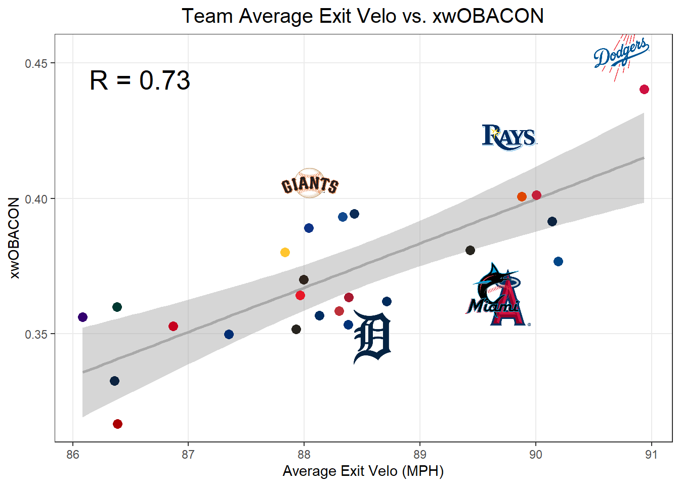
Although the Braves have hit the ball harder than any other team, on average, the Dodgers actually have the best xwOBACON in baseball, because they have hit the ball at more optimal angles. Let’s find the teams whose contact quality is the most different from what their exit velocities would suggest. We can find the biggest outliers by running a linear regression between xwOBACON and exit velo, and pulling out the 3 biggest negative outliers and 3 biggest positive outliers.
hitting_outliers<-lm(hitting_xwobacon~hitting_avg_ev, data =hitting_stats)[["residuals"]]%>%# find residual for each teammutate(hitting_stats, residual =., residual_rank =rank(desc(residual)), is_outlier =if_else(residual_rank>=28|residual_rank<=3, TRUE, FALSE))%>%filter(is_outlier)# keep only top and bottom three outliershitting_stats%>%mutate( point_alpha =if_else(hitting_team%in%hitting_outliers$hitting_team, 0, 1))%>%ggplot(aes(hitting_avg_ev, hitting_xwobacon))+geom_smooth(color ="darkgray", method ="lm")+geom_point(aes(color =hitting_team, alpha =point_alpha), size =3)+scale_color_mlb()+scale_alpha_identity()+# make points of biggest outliers clear so they don't block the logosgeom_mlb_logos(aes(team_abbr =hitting_team), data =hitting_outliers, height =0.15)+annotate("text", min(hitting_stats$hitting_avg_ev)+0.5, max(hitting_stats$hitting_xwobacon)-0.01, label =paste("R =", round(cor(hitting_stats$hitting_avg_ev, hitting_stats$hitting_xwobacon), 2)), size =7)+theme_bw()+theme( plot.title =element_text(hjust =0.5, size =15), panel.grid.minor =element_blank())+labs( x ="Average Exit Velo (MPH)", y ="xwOBACON", title ="Team Average Exit Velo vs. xwOBACON")
`geom_smooth()` using formula = 'y ~ x'
This plot shows us that the Giants, Rays, and Dodgers have better batted ball quality than what you would expect given their exit velocities because they hit the ball at good launch angles, and the Tigers, Marlins, and Angels are hindered by their poor launch angles.
Next, let’s look at team pitching, using the same table we used for team hitting but with pitching data.
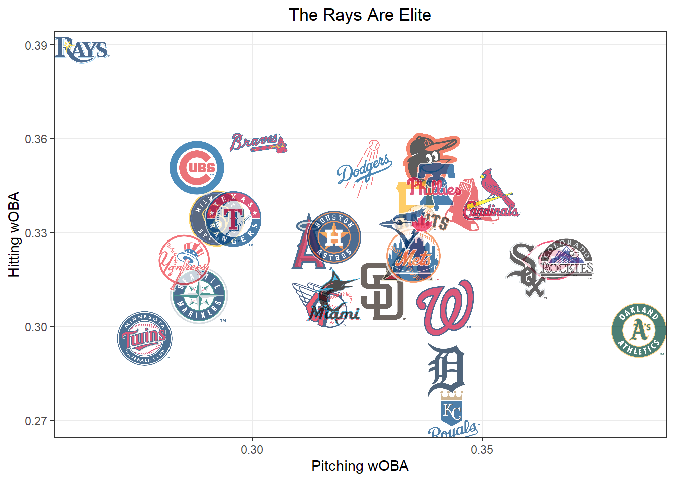
The Rays have also had the best pitching staff in baseball. To see just how special they have been to start out the year, let’s compare team pitching wOBA to team hitting wOBA.
team_data%>%ggplot(aes(pitching_woba, hitting_woba))+geom_mlb_logos(aes(team_abbr =team), height =0.15, alpha =0.7)+theme_bw()+theme( plot.title =element_text(hjust =0.5, size =13), panel.grid.minor =element_blank(),)+labs( x ="Pitching wOBA", y ="Hitting wOBA", title ="The Rays Are Elite")
To compare all hitting stats to pitching stats for each team, let’s make a table. We’ll set up the columns where a positive number is good and a negative number is bad (Pitching Chase% - Hitting Chase%, Hitting Value - Pitching Value for the rest of the stats).
There is a 2.8 runs per 100 pitches gap between the Rays’ hitting and pitching production, showing how elite both their run scoring and suppression has been.
Individal Players
Lastly, you can use Statcast data to evaluate individual players. Let’s build a gt table to see which hitters are currently performing the best, and then check out the tendencies of some of the top hitters in the league so far.
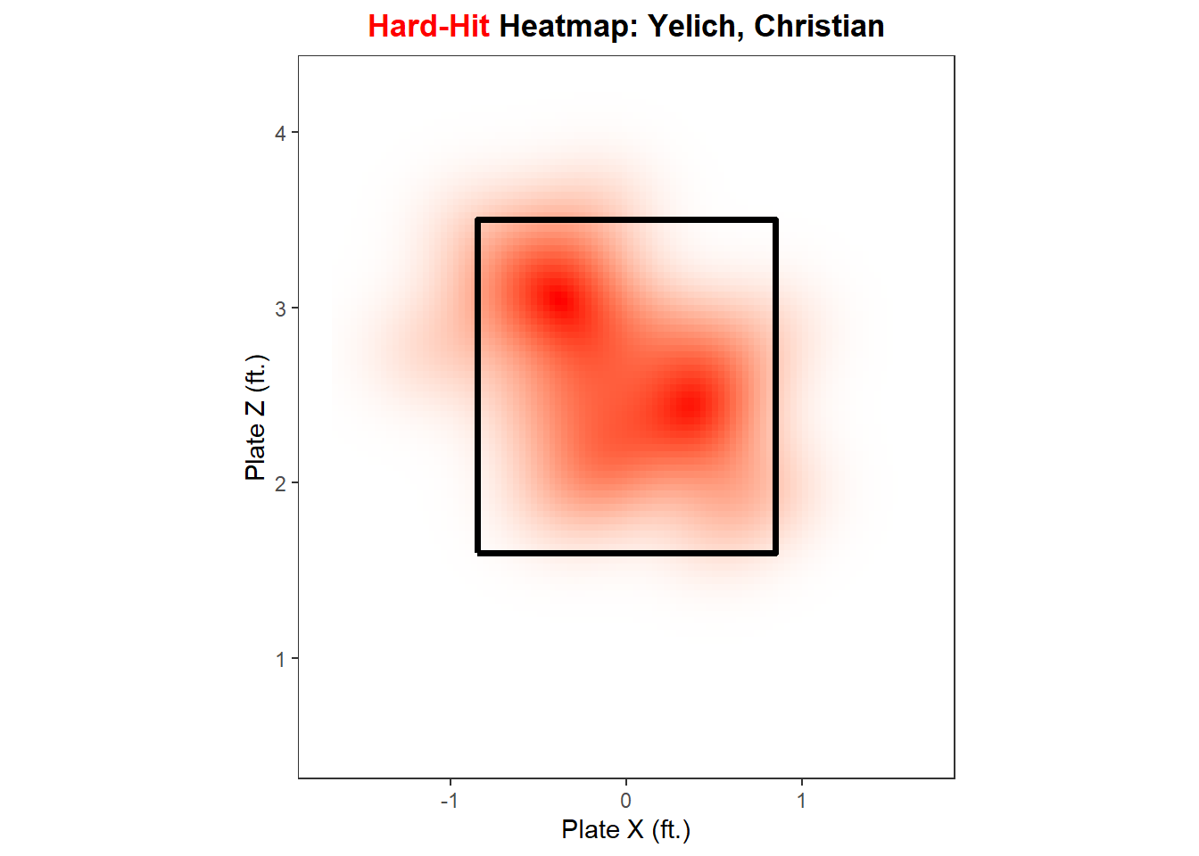
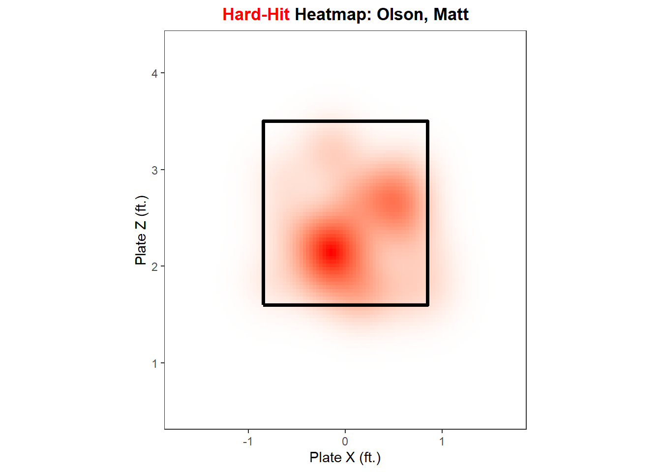
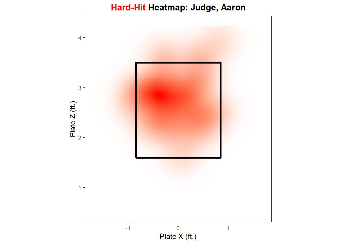
Now, with our summarized data, let’s create a function, hard_hit_heatmap(), to plot a heatmap of a hitter’s hard-hit balls, for all hitters with at least five hard-hit batted balls.
zone_path<-tibble( plate_x =c(-0.85, -0.85, 0.85, 0.85, -0.85), plate_z =c(1.6, 3.5, 3.5, 1.6, 1.6))hard_hit_heatmap<-function(hitter_choice, data=full_mlb){full_mlb%>%mutate(is_hard_hit =if_else(launch_speed>=95, 1, 0))%>%summarize( num_hard_hit =sum(is_hard_hit, na.rm =T), .by =hitter_name)%>%filter(num_hard_hit>=5)if(hitter_choice%in%full_mlb$hitter_name){plot_title<-paste0('<span style="color:red">Hard-Hit </span>','Heatmap: ',hitter_choice)data%>%mutate(is_hard_hit =if_else(launch_speed>=95, TRUE, FALSE))%>%filter(hitter_name==hitter_choice, is_hard_hit,!is.na(plate_x),!is.na(plate_z),abs(plate_x)<1.7,plate_z>0.5,plate_z<4.25)%>%ggplot(aes(plate_x, plate_z))+stat_density_2d( geom ="raster",aes(fill =after_stat(density)), contour =FALSE, show.legend =FALSE)+scale_fill_gradient(low ="white", high ="red")+geom_path(data =zone_path, color ="black", linewidth =1.3)+ylim(0.5, 4.25)+xlim(-1.7, 1.7)+coord_fixed()+theme_bw()+theme( plot.title =element_markdown(face ="bold", hjust =0.5, size =13), panel.grid.major =element_blank(), panel.grid.minor =element_blank())+labs( x ="Plate X (ft.)", y ="Plate Z (ft.)", title =plot_title)}else{cat(paste("Your selected hitter either does not have enough hard-hit balls or you","typed their name incorrectly. Make sure that you type their name in","last name, first name format."))}}
hard_hit_heatmap("Yelich, Christian")
hard_hit_heatmap("Olson, Matt")
hard_hit_heatmap("Judge, Aaron")
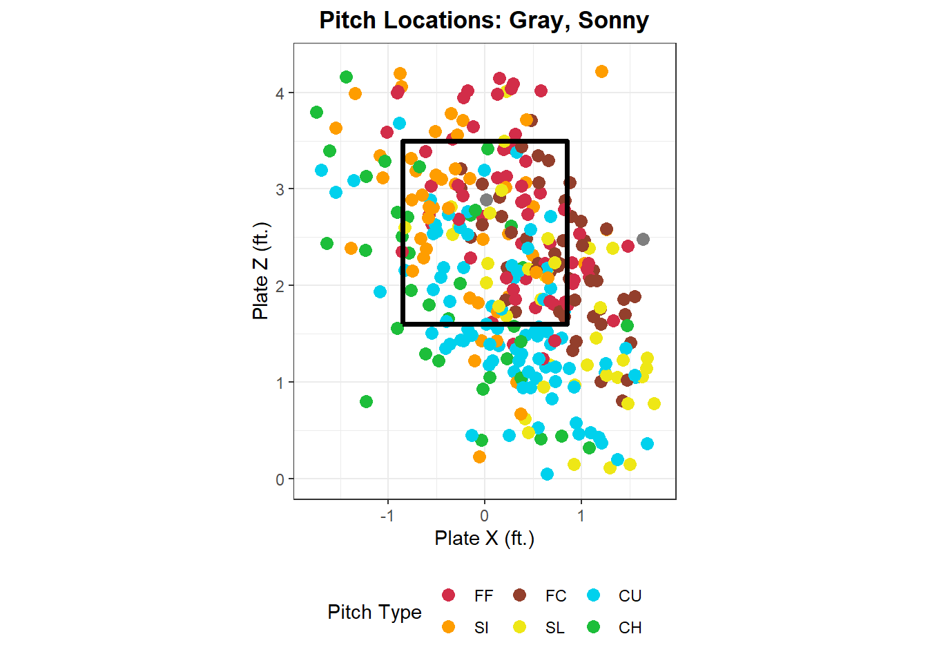
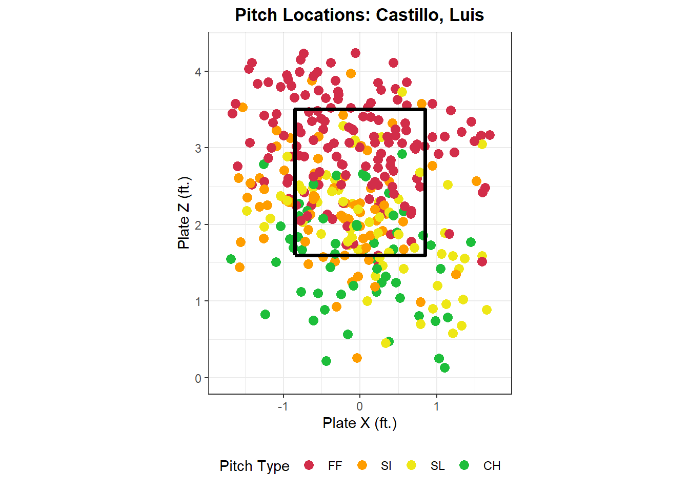
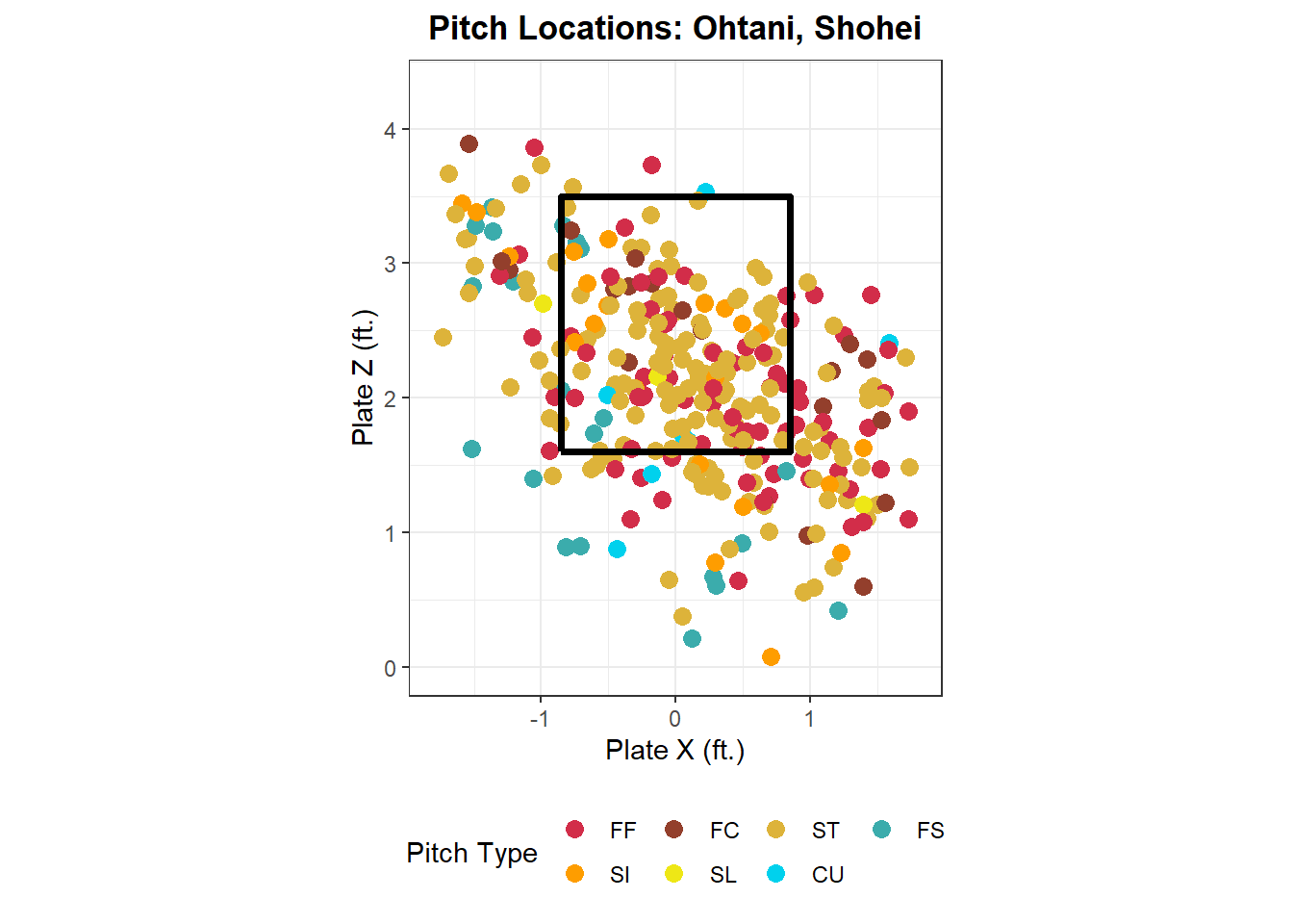
It’s also interesting to see what pitch types a pitcher throws and where, so let’s write a function location_plot() to create a graph of what a pitcher has thrown their pitches this year.
location_plot<-function(pitcher_choice, data=full_mlb){total_pitches<-full_mlb%>%summarize( num_pitches =n(), .by =player_name)%>%filter(num_pitches>=15)if(pitcher_choice%in%total_pitches$player_name){full_mlb%>%filter(player_name==pitcher_choice,abs(plate_x)<=1.75,plate_z>0,plate_z<=4.25)%>%mutate( pitch_type =factor(pitch_type, levels =c("FF", "SI", "FC", "SL", "ST", "SV", "KC", "CU", "FS", "FO", "CH")))%>%ggplot(aes(plate_x, plate_z))+geom_point(aes(color =pitch_type), size =3)+scale_color_manual(values =sc_colors)+geom_path(data =zone_path, color ="black", linewidth =1.3)+xlim(-1.8, 1.8)+ylim(0, 4.3)+coord_fixed()+theme_bw()+theme( plot.title =element_text(face ="bold", hjust =0.5, size =13), legend.position ="bottom")+labs( x ="Plate X (ft.)", y ="Plate Z (ft.)", color ="Pitch Type", title =paste("Pitch Locations:", pitcher_choice))}else{cat(paste("Your selected pitcher has either not thrown enough pitches or you have","typed their name incorrectly. Make sure that you type their name in","last name, first name format."))}}
location_plot("Gray, Sonny")
location_plot("Castillo, Luis")
location_plot("Ohtani, Shohei")
Statcast data opens up the opportunity for so much analysis, and R makes it simple. I hope you enjoyed this tutorial and were able to learn from it. Feel free to reach out on Twitter @Drew_Haugen if you have any questions!